Practical Applications of Data Analytics and Visualization
We are in an age where information is king, and making decisions based on “real-time” data provides a competitive advantage. Necessity has shifted the old reporting paradigm of row-and-column reports to more visual and graphical reports.
 By Bryan L. Smith, CPA, CITP, CISA
Join Bryan at the PICPA's CFOs and Controllers Conference.
The CPA profession is steeped in tradition. Some say accounting dates back to 2500 B.C., but most view Luca Pacioli as the father of accounting, with his Summa de arithmetica, geometria, proportioni et proportionalita from 1494. Over the past five centuries, many things have changed, but one thing, however, remains the same: the need to report financial performance. Pen and ink were the primary means of reporting during most of this time, but in the 1990s most CPAs adopted computers to make the reporting process easier. But was it any better? Think about the traditional financial report or spreadsheet with its series of rows and columns of numbers. The numbers tell a story, but what that is isn’t always easy to see. Rows and columns of data can be difficult to analyze.
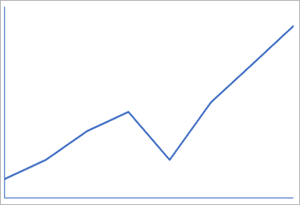
 It is now 2020, and our data has grown exponentially to the point where it impossible to list it in rows and columns on a report or in a spreadsheet. That’s a problem. We are in an age where information is king, and making decisions based on “real-time” data provides a competitive advantage. Necessity, they say, is the mother of invention; and necessity has shifted the old reporting paradigm of row and column reports to more visual and graphical reports. Take the line chart for example. There are no numbers on the report, but people can make some determination of what the data tells us:
- It is increasing
- There was a dip or decline
- The dip did not last long
- After the dip, it started increasing again
If we add additional parameters, such as sales, expenses, production, web traffic, etc., we can make further presumptions of what our data is telling us. This doesn’t mean we can make definite conclusions, but it provides a basis to quickly spot trends, patterns, issues, and so on – something that is much more difficult if this same data is presented in rows and columns.
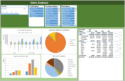
CPAs rely on electronic accounting systems, financial reporting systems, and electronic spreadsheets to prepare their various reports. Often, we don’t like the look and feel of the reports that come out of these systems, so we put the data into Microsoft Excel to build a report that looks good. If we are proficient at Excel, we may even use PivotTables or PivotCharts to display our data. If we are really proficient at Excel, we may even create an Excel dashboard. This, however, is not for the faint of heart because it is not simple.
 Today, though, we may now have an even better way. There has been a recent explosion in data visualization tools. Many allow you to do the following:
- Connect to your data sources to perform real-time data analysis.
- Access unlimited data without bringing your analysis to a screeching halt.
- Connect to multiple data sources without using Excel’s VLOOKUP function.
- Create calculated measures for specific metrics that are important to your organization.
- Easily build interactive visualizations that allow users to dig deeper into your data. Remember the dip in our chart above? Users can drill into the detail that explains the cause.
- Provide users with dashboards of the most important metrics for their job function.
The bottom line is CPAs must embrace this level of communication and move away from more simple reporting processes. It is with and through data analysis that we learn what our data is telling us, and that is way more valuable than simply reporting raw data. Data analysis and visualization allow us to do the most important thing for our organizations: make better decisions.
Bryan L. Smith, CPA, CITP, CISA, is CIO of CPA Crossings LLC in Rochester, Mich. Join Bryan at the PICPA's CFOs and Controllers Conference where he will discuss the practical applications of data analytics and visualization.
Sign up for weekly professional and technical updates in PICPA's blogs, podcasts, and discussion board topics by completing this form.
PICPA Staff Contributors
Disclaimer
Statements of fact and opinion are the authors’ responsibility alone and do not imply an opinion on the part of PICPA officers or members. The information contained in herein does not constitute accounting, legal, or professional advice. For professional advice, please engage or consult a qualified professional.


